
The Agile methodology has several metrics that show the operational side of software development. E.g., some reveal process efficiencies, speed of development, the time taken to complete a particular feature, etc.
However, in the right context, these operational metrics tell a story that uncovers real business value delivered. In this post, we aim to uncover Agile metrics that help you move from information to insights.
Data-driven responsiveness
The time between when the work started (not just a task creation but working on a real story point) and work delivered is considered the cycle time or the time-in-process. While an average value of this metric tells you about how soon a specific feature can be achieved, it does not say anything about the certainty of delivery within a requested time frame.
A year’s worth of development looks something like this:
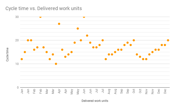
Source: Internal Data
The X-axis is essentially the passage of time for an entire year divided by months. The Y-axis shows the number of days for each delivered work output across two weeks of a sprint. While there are outliers, about 85% of the work is delivered within between 10 and 20 days.
This data point helps answer questions from customers like, “Can this feature be delivered within 12 days”. Looking at this chart, we see that we can deliver the requested feature within 20 days with 85% certainty.
A key point to note here is the context. This data-driven responsiveness assumes that we are working with an equally skilled team, has sufficient domain knowledge, and has worked on similar projects for the majority of their time.
Predictability of delivery
Throughput and sprint velocity are essential metrics. Sprint Velocity is the average value of story points completed in a sprint over a defined period. Throughput is the number of story points completed over time. For instance, in the above graph, the median throughput is 16 units of work per sprint.
Throughput metrics also give a good deal of insight on team productivity and can be used to evaluate team consistency and match between the work that needs to roll out and skills required to perform this work.
Sprint velocity is a good metric for detailed sprint planning. However, throughput is good for setting high-level management goals that affect important company performance indicators. Merely looking at the throughput figure tells us little. However, upon looking at the product backlog, it would be easy to find out the units of work needed for a specific feature and then dividing them by the throughput. The resulting number would let product owners know the timeline required to deliver a particular feature.
This resulting timeline gives fairly good predictability on the delivery of specific features within a certain time frame.
Value delivery
One of the cornerstones of Agile methodology is the value delivered to the customer. A net promoter score (NPS) associated with a release, can help product owners fine-tune their market understanding.
The Net Promoter Score is calculated in response to a single question – “How likely are you to recommend this product to others?” Respondents with scores of 9 and 10 are called promoters. Ones with scores of 7 and 8 are classified as passives while anyone with a score of 6 and less is detractors. The NPS is then calculated by subtracting the detractors from the promoters. The passives contribute towards the overall count and hence bring down both the promoters and the detractors.
An NPS can help product owners understand if a feature rollout is timed with a market trend and hence helpful for their customers. This feedback, in turn, better helps product backlog grooming and prioritize feature releases to be more in sync with customer needs.
Contextual data to insights
Borrowing from the Kanban world, a cumulative flow diagram tells quite the story – in conjunction with the earlier metrics we talked about here. Let’s consider the following cumulative flow diagram:
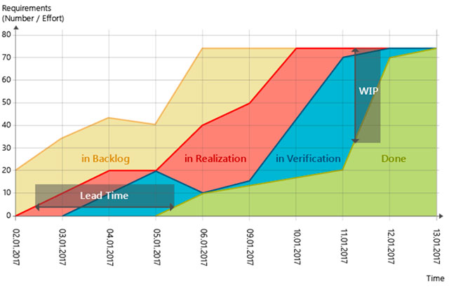
Image source: MicroTool
In the Backlog part of the graph, the slope of the line between any two given dates represents the arrival rate of work. At the same time, the slope of the line in the ‘Done’ section defines the departure rate of work. At any given point, the skew between these two rates dictates confidence in the release schedule.
Taking an average over a more extended period is straightforward. However, averages may not show the right picture. All numbers should coalesce within the context of the situation. For instance, some months may have an unusually large number of bugs to be fixed. This fix comes at the cost of other work that goes on the back burner. Or there is a feature that is rush-requested by a c-level executive. This rush job too would come at the cost of the regular set of work that is getting delivered.
Conclusion
The Agile methodology defines plenty of metrics. However, most agile metrics show an individual piece of information that when read in isolation, tells us very little. In the context of other information, these metrics show valuable insights. And they paint the right picture in terms of business value delivered.
This post is meant to get you thinking about how the product development process can quantify business value. We’d love to hear your thoughts in the comments below.