When I mention ‘terms and conditions,’ what comes to your mind? Long annoying scrolls of text filled with legal jargon? Something that we ignore all the time.
However, these boring pages are valuable to the business as well as the consumers. Did you know that not having a clear and concise ‘terms and conditions’ can harm your business?
I too ignored these walls of text until I was asked to create designs for the ‘terms and conditions’ page for an eCommerce and auctions website. This request took me by surprise as until then I thought that terms and conditions are just legal data. What could a designer possibly have to do with this?
At this point, I realized that this is a problem of ignorance and it is our responsibility as designers need to try and change this.
The ‘terms and conditions,’ ‘Terms of Service’ or ‘Terms of Use’ are a set of regulations that users must agree to continue using a service. These rules are designed to protect you, your business, and your customers in case of a dispute.
Why is the ‘terms and conditions’ page important?
In 2012 Instagram attempted to change its terms and conditions by adding a statement that said they are allowed to “sell uploaded pictures to advertisers.” As was expected, this upset their users, leading to angry tweets and emails with hashtags like #Instascam, #Instafraud, and #leavinginstagram. Instagram later apologized, altered the lines, and managed to survive the backlash.
Since this was Instagram, it managed to survive. However, for smaller less-known businesses, this can cause irreversible disruptions.
The ‘terms and conditions’ page is thus crucial for business as well as its customers. It is a bridge that facilitates clear communication and solutions to possible disputes.
Here are a few benefits of clear and easy-to-understand ‘terms and conditions,’
- Brand trust. Users know that the brand truly cares about them when the ‘terms and conditions’ page is easy to read. A ‘terms and conditions’ page also helps send trust signals to Google. These signals lead to a more positive SEO impact and less likelihood to be penalized for suspicious usage.
- Avoid customer outrage. If the terms are unclear or confusing, users may feel misled, which can hurt or anger them.
- Protection from lawsuits. In extreme cases, inconsistencies in a terms and conditions page can result in legal penalties.
There are different legal sections that are mandatory as a part of your website/app and have legal importance. The exact content that forms the ‘terms and conditions’ depends on various factors such as the type of business, region of operation, and if third-party services are involved. However, the vast majority of ‘terms and conditions’
have substantial commonalities. Here are the essential elements you need to include,
Disclaimer and limits liability
Websites that accept user content submissions list disclaimers and liability limits. This disclaimer substantially limits their responsibility for the content on their website. Sites where content moderation by the site owners is not possible or where there are links to external pages list these disclaimers. A disclaimer says that the site owner isn’t responsible for the content or links.
Copyright notice
A copyright notice helps take care of plagiarism. Regardless of your business, your website should always include a copyright and trademark notice.
Privacy policy
A privacy policy usually applies to websites that collect user information such as email addresses, personal data, or payment information. This privacy policy states how the business will use this information. Note that this is the only part of the ‘terms and conditions’ that is legally required.
Governing law
Every business’ ‘terms and conditions’ limit their liability to the law of the country and state where the company operates. You may often find statements such as, “These terms and conditions are governed by the laws of the United States of America and the laws of the State of California.”
Why do users ignore it?
Usually, users have no choice as they need to use the app/website to accomplish a specific task or a goal. They rarely have the time and the legal expertise to dwell over details.
These are some issues users face with regards to the ‘terms and conditions’ page:
- Users often agree with ‘click to agree’ clauses, and rarely read large paragraphs of legal text. They, however, realize its importance only when a dispute arises.
- Most of the Pages have long scrolls that have tedious language and are time-consuming.
- Legal experts write this text, and it is full of legal jargon. This jargon makes it difficult to understand even if one tries to read them.
- At times, ‘terms and conditions’ are difficult to find or navigate to and mostly inaccessible.
- They may contain unclear or misleading clauses and hidden content that users are unable to grasp.
As is expected, the over experience is frustrating for users, and they often ignore the page and agree to the terms that they have not read and understood. The onus then lies on us as UX designers to make this page more consumable and valuable for our users so they can make informed decisions.
How can Design make it better?
While it is not advisable to spend a lot of time on this, small fixes and tweaks can help address the issue.
When design invites people to consider their options, at least some people will do it. On the other hand, if design nudges them to follow a habit that years of click-to-agree has instilled, then they’ll keep doing that instead. There are a few companies that are aware of this issue and trying their best to better their terms and make it a better experience for their customers.
Here are a few simple ways and examples for bettering your ‘terms and conditions’ pages,
Information grouping and structuring
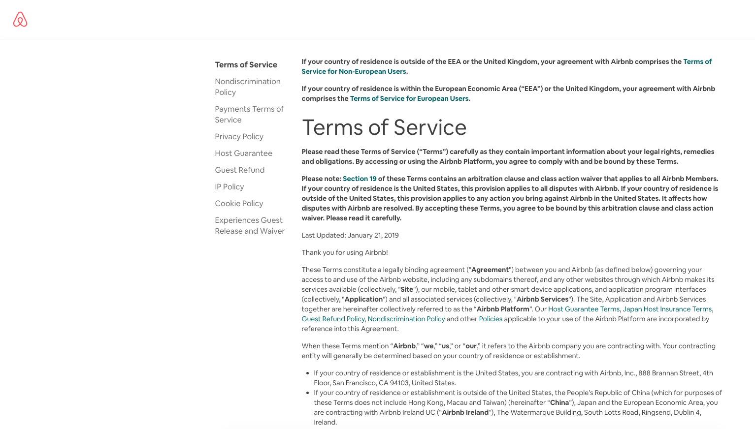
Airbnb’s ‘terms of service’ makes the content more organized and accessible.
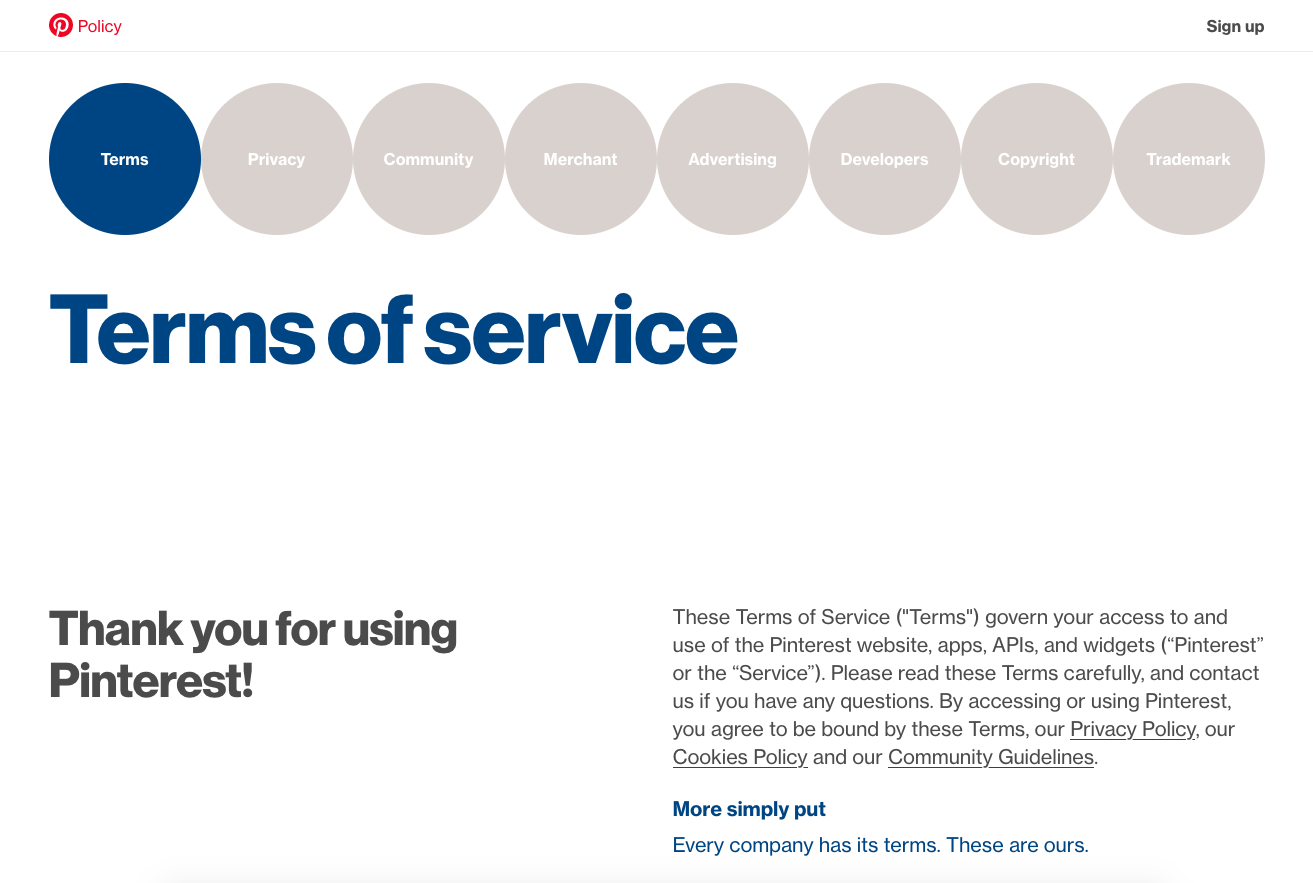
Pinterest grouped and gave an upfront index of required sections. It also provides an easy to read two column layout.
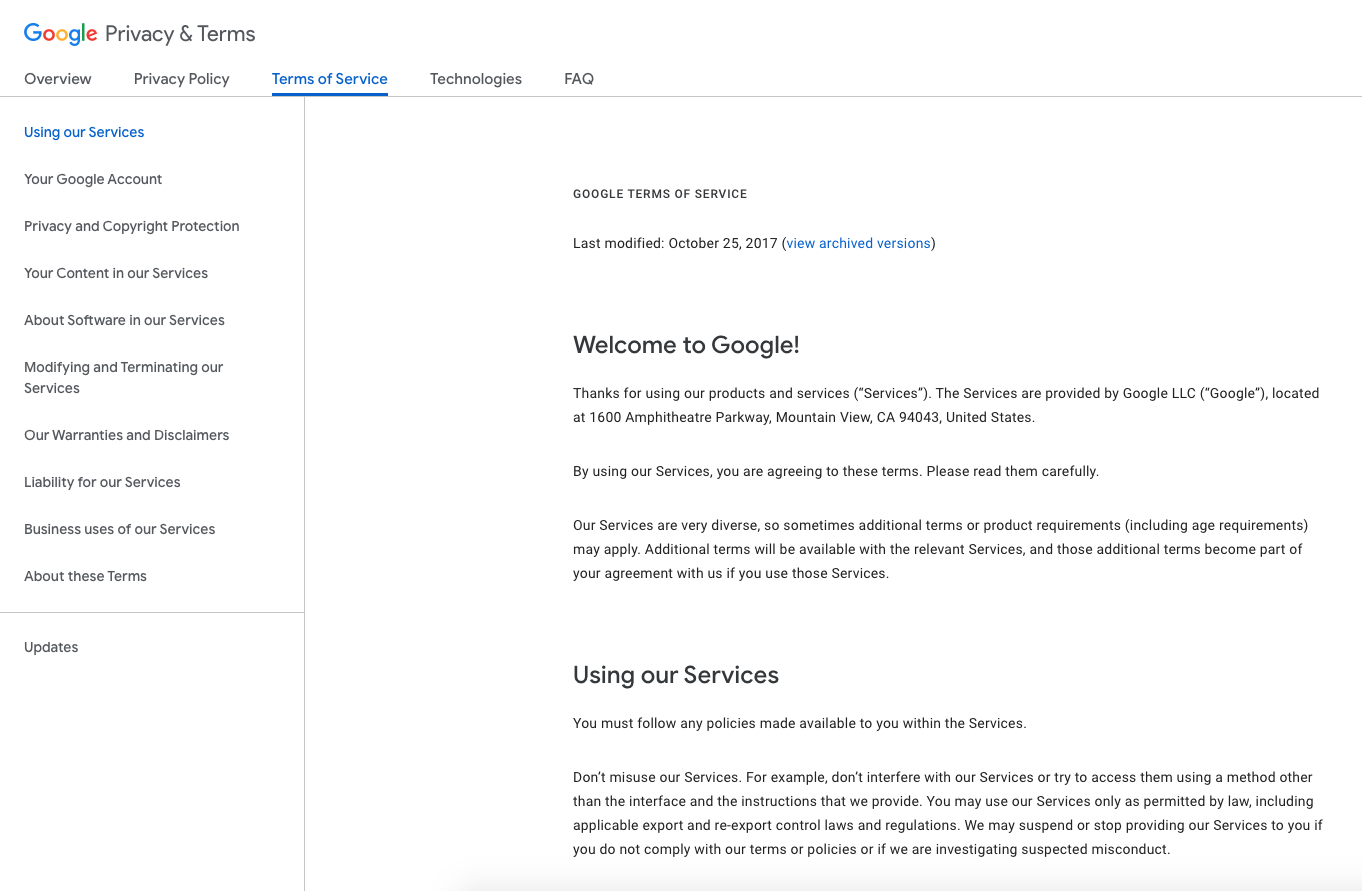
Add a ToC
Adding a Table of Contents can help the user find and assimilate information more easily.
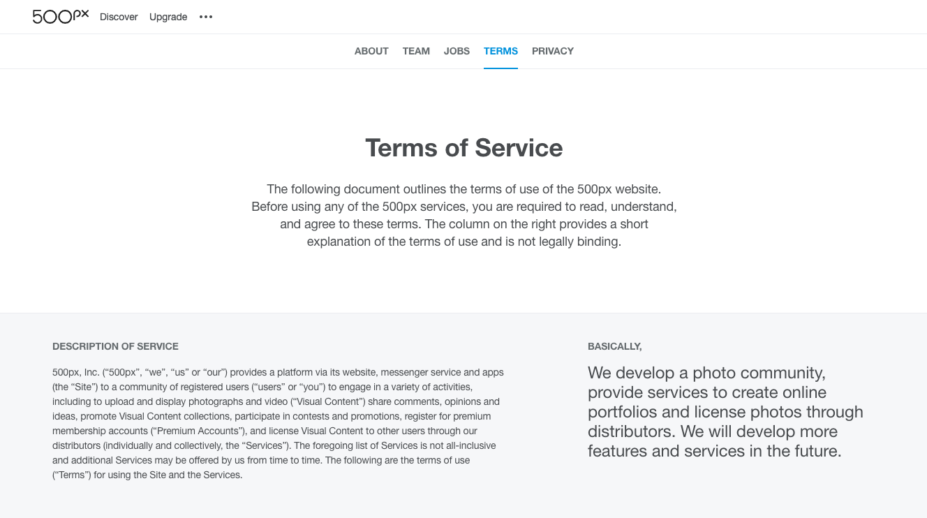
Include summarised translations for sections
A layman’s version of the legal text helps people understand them quickly and makes them feel valued that the brand cares for them. The 500px website terms is another excellent example. Here a basic translation of the legal words in plain English helps users understand its implications.
Additional Information and support
Micro design elements help users better understand possibly confusing text. Adding information popups where needed helps improve user experience.

Use of icons and imagery
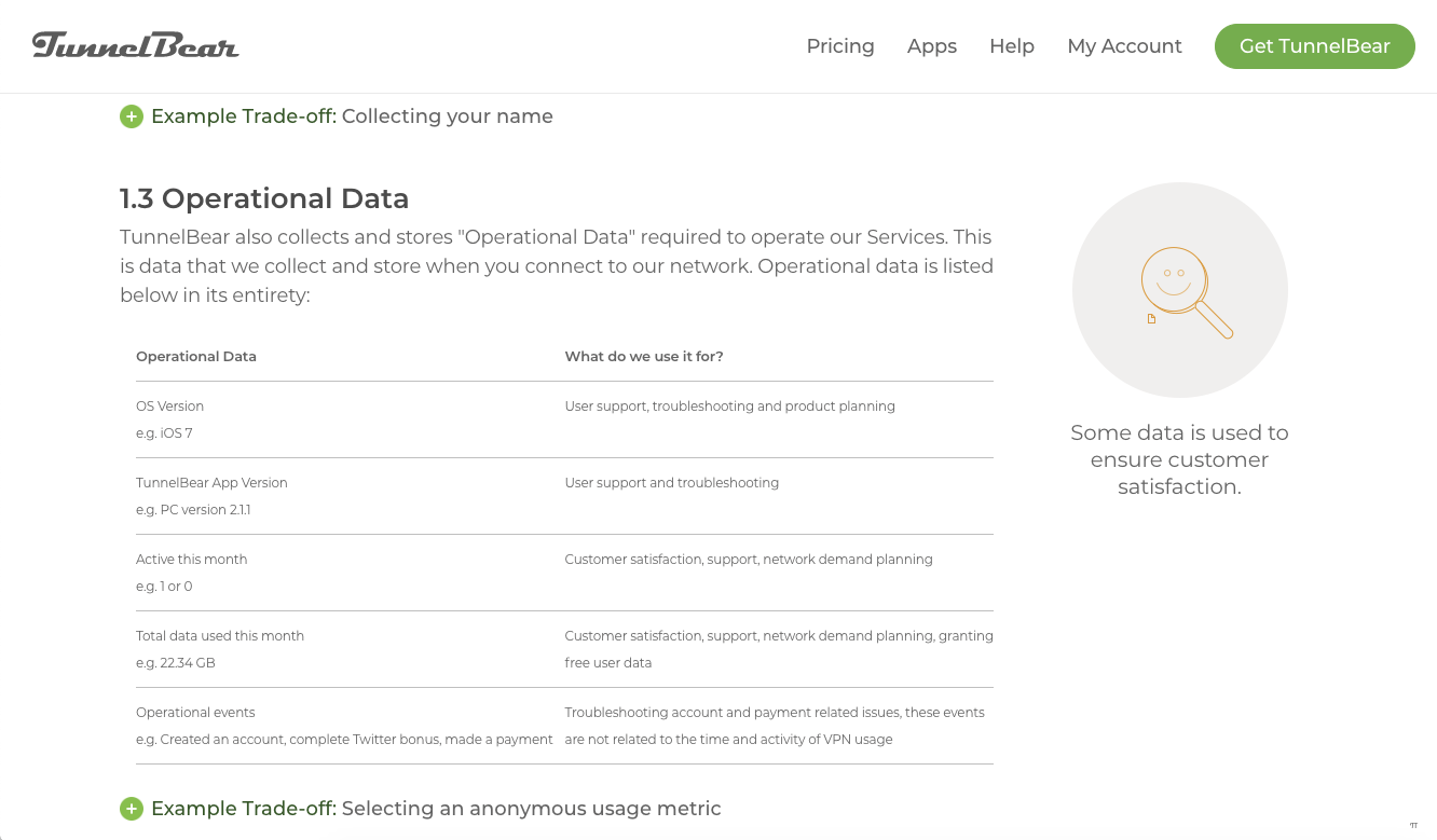
This helps reduce strain on the eyes due to plain text and makes it more consumable and easy to navigate. Tunnelbear, a VPN service, makes it incredibly easy to understand their terms of use. As seen below eBay uses iconography, grouping, and indexing with good visual appeal
Fonts and spacing
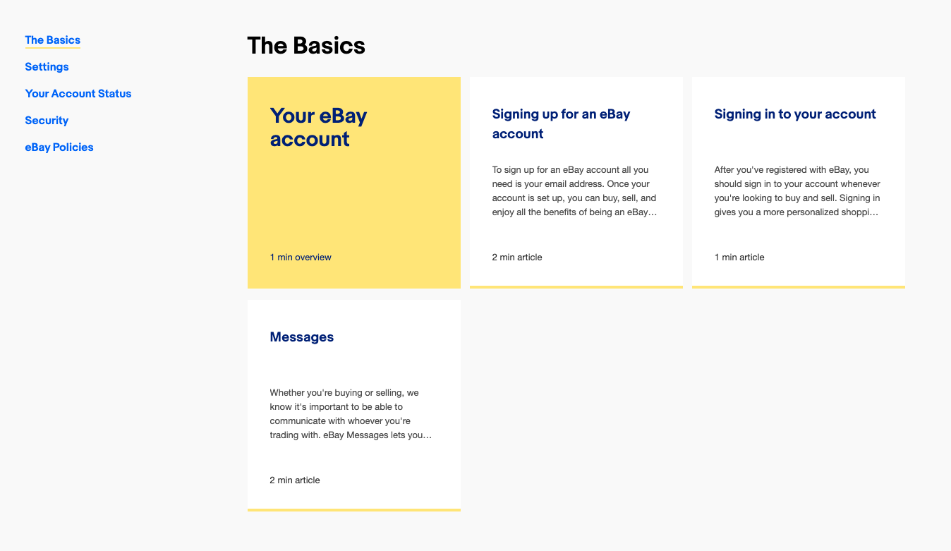
Proper font sizes and spacing can make a huge difference in guiding the user to read through.
For example, shorter rows of text are easy to consume than end-to-end lines, highlighting important information with larger fonts or more weighted fonts.
As shown below better-spaced fonts and hierarchy helps easily assimilate information making it easy to find a particular topic.
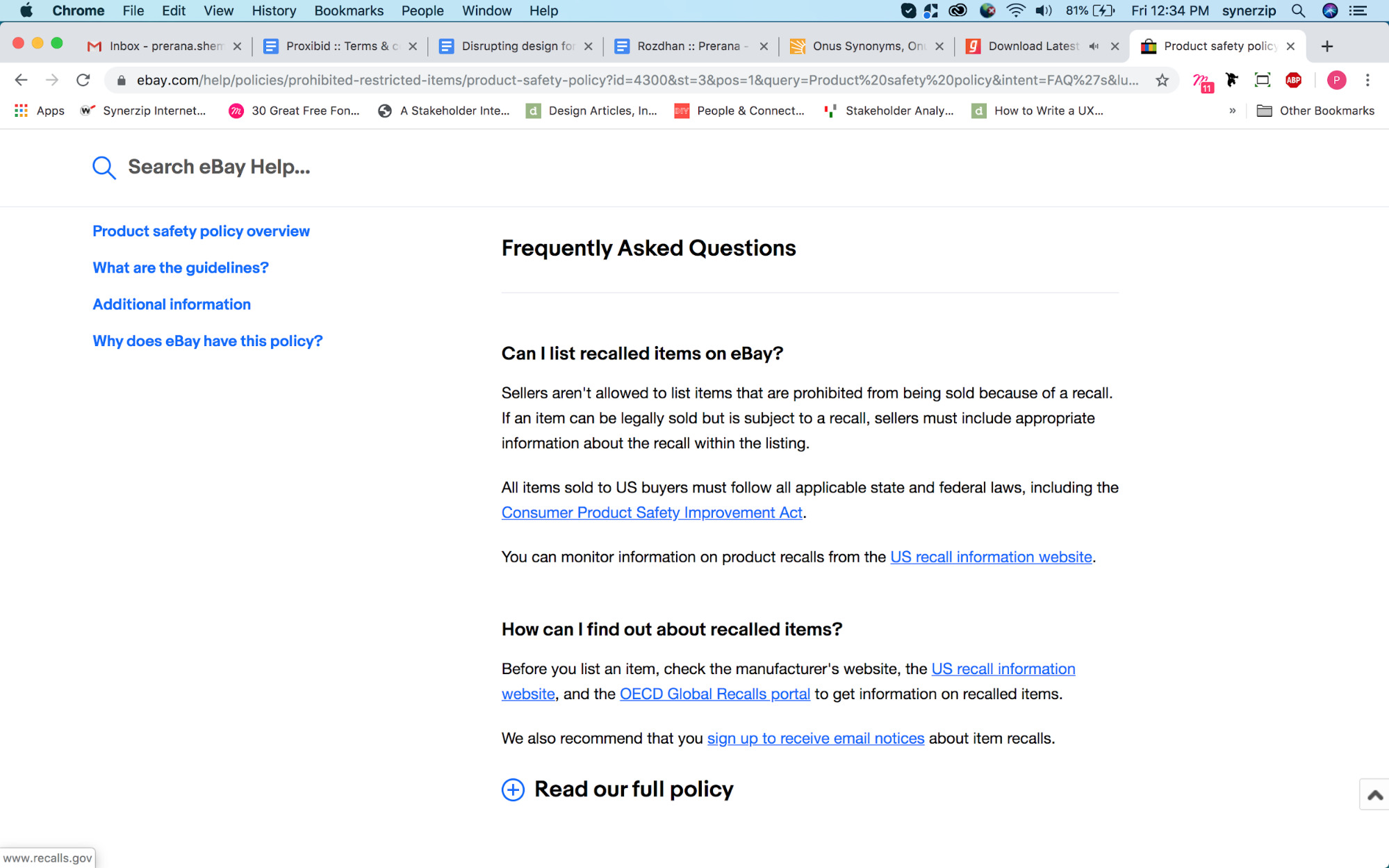
Help & FAQ format
Most users visit the Help section when they have issues or questions. A well laid out FAQ page can help them find what they seek and sort queries faster.
Keep your ‘terms and conditions’ updated
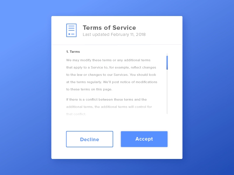
When changing your terms and conditions, describe what is changing, explain why it is changing, and Illustrate with real world examples of how it would affect your users. Ensure to highlight key points, and work on the copy and language to sync it with your brand voice and tone.
Key takeaways
- Discoverability – the page should be easy to find with a link on the homepage
- Simplicity – ensure the ‘terms and conditions’ content is understandable for the average reader. Another option is to divide it into separate sections (for users, clients, and people with legal expertise such as lawyers).
- Personalization – the exact terms of usage of your business website. For example, an e-commerce site will include wording on credit card data, refunds, and returns. Yet, a fitness center will include a cancellation policy and disclaimer on health concerns.
- Update – Update the ‘terms and conditions’ page regularly
Conclusion
Terms and conditions are thus a key part of the user experience and shouldn’t be neglected during the design phase.
It is the designers’ responsibility to focus on user experience and design transparent products. These small tweaks will help improve the user experience of a page that has often been ignored by us.
References
- Berreby, David. “Click to Agree with What? No One Reads Terms of Service, Studies Confirm.” The Guardian. Guardian News and Media, March 3, 2017. https://www.theguardian.com/technology/2017/mar/03/terms-of-service-online-contracts-fine-print.
- “Terms and Conditions: A Snapshot of Confusion.” Terms and Conditions: A Snapshot of Confusion | UX Magazine. Accessed September 24, 2019. https://uxmag.com/articles/terms-and-conditions-a-snapshot-of-confusion.
- Episcopo, Erik. “Improving the UX of Your Terms and Conditions Page (and 6 Easy Ways To Do It).” Mind the Product. Mind the Product Mind the Product Ltd, October 20, 2017. https://www.mindtheproduct.com/2017/10/improving-ux-terms-conditions-page-6-easy-ways/.
- weDevs. “Top 10 Types Of Must-Have Legal Pages For Websites.” weDevs, November 12, 2018. https://wedevs.com/137970/legal-pages-for-websites/.
- “Does My Website Really Need a Terms and Conditions Page?: FreshBooks Blog.” FreshBooks Blog – Resources & Advice for Small Business Owners, June 9, 2019. https://www.freshbooks.com/blog/does-my-website-really-need-a-terms-and-conditions-page.
If you liked this post, here are a few more that might interest you,


