Health data visualization, in a nutshell, is the consolidation of disparate medical data from different sources into a graphical form for quick comprehension. These displays are examples of infographics, charts, tables, timelines, scatterplots, etc. Medical professionals can benefit significantly from visualizations because it expedites the process of data analytics interpretation, improves recognition of trends, and enhances the quality of decision-making.
To provide better care, modern healthcare systems constantly gather and record massive amounts of data. Electronic health records (EHRs), disease registries, home monitoring equipment, hospital information systems, billing and coding programs, and other sources all contribute data. In addition, hospitals and other healthcare facilities must process information from thousands of Internet of Things (IoT) and wearable devices.
Massive data stores are useless unless data visualization aids in the search for relevant information and quickens the decision-making process for medical professionals. Therefore, instruments for visualizing data are now considered fundamental. Following are some healthcare-related instances of data visualization.
Interactive displays
The most popular visualization tool healthcare organizations use is dashboards that merge multiple interactive pieces of information into a single cohesive whole. They can integrate into pre-existing programs alongside data analysis features, or they can form the basis of specialized reporting applications designed to meet the demands of a given business.
In general, dashboards fall into three categories:
- Ready for use in real-time data visualization
- Helpful in illustrating long-term developments and tendencies
- Analytical for complex analytics that incorporates multiple visual reports into a unified framework.
Games, widgets, and other interactive software
Users can tailor their experience with the data thanks to interactive maps, websites, or widgets. The BBC, for instance, has a page detailing recent COVID-19 case statistics. In addition, visitors can find data visualizations in the form of infographics, interactive maps, and charts across the site. Users better grasp the information provided via a combination of static images, infographics, and interactive charts and maps.
Infographics and animated graphics
The infographic is a primary but effective method of presenting complex material to the general audience in a visually appealing and straightforward manner. For example, a Johns Hopkins University infographic includes essential details on breast cancer, emphasizes recent statistics, and offers advice for avoiding the disease supported by evidence. Infographics are visual representations of data intended to be quickly grasped and communicated. The term “motion graphics” refers to a specific type of animated infographic commonly used in promotional videos, tutorials, and other forms of video-based education.
In healthcare, stakeholders and patients can benefit from the clarity and accessibility of data visualization technologies by viewing information in a streamlined style.
Using visual representation of data in the medical field
Since the human brain is more adept at processing images than reading words, visualization tools can significantly improve presentations and reports. Data preparation, modeling, and visualization are all parts of the analytic process. Artificial intelligence (AI) and machine learning technologies are improving healthcare analytics. However, if a business wants to get the most out of data analysis, it must use visualization tools.
Data visualization’s positive effects on healthcare
Health care enhancement
Medical professionals can quickly recognize and respond to potential dangers with the right visualization tools. Doctors may better define patient populations and allocate resources by displaying health data in real-time. Including all patient records in a dashboard reduces the likelihood of doctors overlooking critical information. This new understanding could reduce the occurrence of drug intolerance cases, enhancing the effectiveness of treatment.
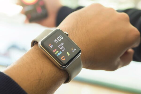
The proliferation of fitness applications, wearable gadgets, biosensors, and other clinical devices monitoring patients’ real-time physiological data can save more lives than ever.
Doctors can use this information to make prognostications about their patient’s health after adding it to their electronic health records (EHRs).
Heart problems, for instance, may be uncovered by plotting a patient’s heart rate against time. Preventing medical catastrophes is possible.
Recognition of patterns
Doctors may better forecast their patients’ health and make more accurate diagnoses using data visualization software equipped with predictive analytics technologies. In addition, data collected from fitness apps and wearable devices, such as heart rate, can help doctors diagnose and treat illnesses in their early stages.
Healthcare data visualization aids pattern recognition in inpatient treatment and government identification of patterns to assist strategic public health decision-making.
Targeted Presentations
A picture is worth a thousand words to the human brain. However, different audiences, such as business owners and other stakeholders, marketing experts, regulators, and compliance officials, require varying degrees of detail and complexity in their depictions. Regardless of their familiarity with or ability with data or business analytics, anyone can benefit from the insights generated by healthcare data visualization tools.
Clear and simple charts and infographics improve patient awareness and increase participation, making visualization a helpful tool for patient education. As a result, you could be more inclined to make beneficial changes to your lifestyle.
Increased efficiency
In contrast to time-consuming manual reporting, real-time data visualization greatly accelerates the interpretation of information, allowing healthcare businesses to reduce inefficiencies, make decisions more quickly, and save money.
Medicare, for instance, offers bonuses or penalties to hospitals depending on how satisfied their patients are. In addition, hospitals can identify issues to focus on and improve results by tracking and visualizing factors linked to the patient experience, such as the patient’s input on communication with medical staff or wait time.
Hospital administrators can benefit from better judgments thanks to data visualization. Wait times, admission rates, treatment costs, and diagnosis categories are all examples of data that could be useful.
Making intelligent decisions about health care
The Coronavirus Research Center at Johns Hopkins University estimates that over 500,000 Americans have lost their lives to COVID-19. To keep tabs on the growing death toll, researchers have used various data visualization methods thus far.
Visualization and analysis of this data accelerate research such as the one to approve the COVID-19 vaccines by Pfizer-BioNTech, Moderna, and Johnson & Johnson/Janssen.
Ensure compliance with public health regulations
Data visualization in public health helps public health professionals make better decisions. For example, good data visualization aids in making the call to impose health regulations.
According to data visualization dashboards, public health officials have mandated face masks. According to healthdata.org, when the death rate reached eight per million per day, 90% of jurisdictions enacted mandatory regulations.
Determining mistakes and identifying fraud
Medicare fraud and abuse cost the program an estimated $58.5 to $83.9 billion annually. Double or ghost billing, numerous bills for a single service, faked prescriptions, insurance fraud, and other schemes are all examples of fraud perpetrated in the healthcare industry by both professionals and patients.
With the help of data visualization, relevant professionals can better understand the relationships between patients, doctors, hospitals, insurance companies, and claims. Moreover, administrators can quickly uncover medical billing and prescription fraud with the help of visualization tools combined with machine learning and artificial intelligence.


