PWA or Progressive Web Apps are web applications delivered in an app-like format, and for all practical purposes, they behave like mobile apps. They are built using standard web technologies such as Javascript, HTML, and CSS and can be rendered in any standards-compliant browser. In this blog post, we take a hands-on approach to how UX designers should approach PWA. For a lowdown on PWA, its evolution and its current state be sure to sign up for our upcoming PWA webinar.
PWA behaves like a mobile app and enables most of its useful features such as push notifications, device hardware access, ability to work offline, etc. PWA allows experiences to similar to mobile devices.
While mobile-friendly pages have existed for as long as mobile devices itself, however, these pages lack the user experience in terms of speed, features and user adoption. While PWA runs exceptionally well on Android operating systems, they do suffer from performance issues on Apple’s iOS.
Benefits of Progressive Web Apps
PWAs are responsive apps and have cross-browser support. PWAs also make the process of development and deployment much more straightforward. Developers can quickly deploy new features, make enhancements, and resolve bugs. Users can soon see an updated version of the app with a simple browser refresh. It’s a cost-effective and time-efficient way of developing web apps that significantly reduces designer and engineer work overheads.
A few benefits of PWA:
- Intuitive, Trustworthy and Quick
- Hassle-free experience
- Quick response with animations
- Engage users without janky Scrolling
Building Progressive Web Applications
From a specialist’s point of view, there are several rules developers must adhere to when building PWAs. Similarly, it is crucial for the UX Designer to think about the pros and cons of different Operating Systems and ways to accomplish the best outcome.
This post describes in detail the checklist needed to build progressive web applications from a designer’s perspective.
Splash Screen
The image below shows differences between Android (default splash screen) and iOS splash screens (customized splash screen)
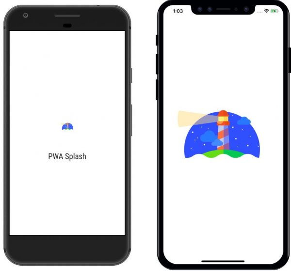
The splash screen for PWA apps on a mobile device gives the feel of a native application. While this is a default feature for Android, they need to be independently created for iOS. Splash screens can be displayed until the application is ready to launch.
For the Android operating system, a white screen shows by default. However, we can customize it by displaying either the application logo, application name, or any animation.
Tip: Splash screens for iOS, show two splash screens for an Android user. One way around this glitch is to either show both screens on Android and iOS in the same sequence with some micro animation or redesign the same default screen for iOS and Android.
Push Notification
Push notification differentiates a native app from a web app, and PWAs can send push notifications on both desktops and mobile devices. While Android supports this feature iOS users will have to wait for some more time for it to become available.
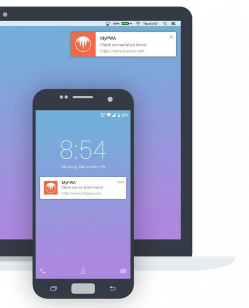
Tip: Apple quietly added support for push notifications on its Safari browser. Other browsers on iOS such as Chrome and Firefox, do not support push notifications yet.
App Shell
The App Shell is useful for showing some initial data on screen without a network, similar to what we see on native apps.
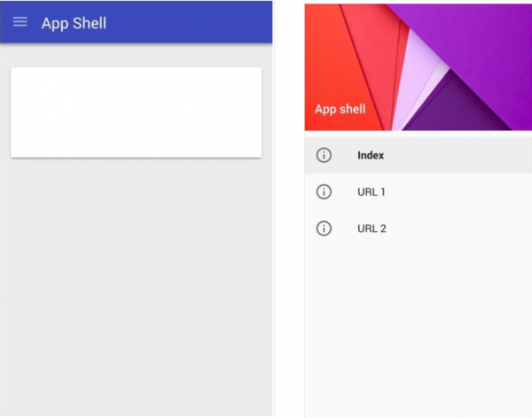
We can include Header and Footer in the App Shell to keep the user informed in the event of a network failure.
Tip: It is the responsibility of the UX designer to include these to ensure the best experience.
Ask Users for Permissions
While PWAs can access device hardware such as camera and location best practice dictates asking the user for access permissions similar to native apps.
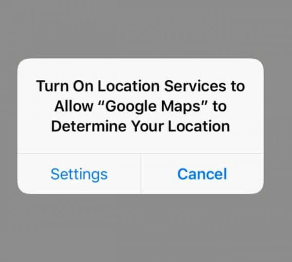
Note: Don’t overlook these basic use cases while designing the PWA application.
Add to the home screen
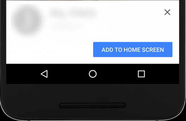
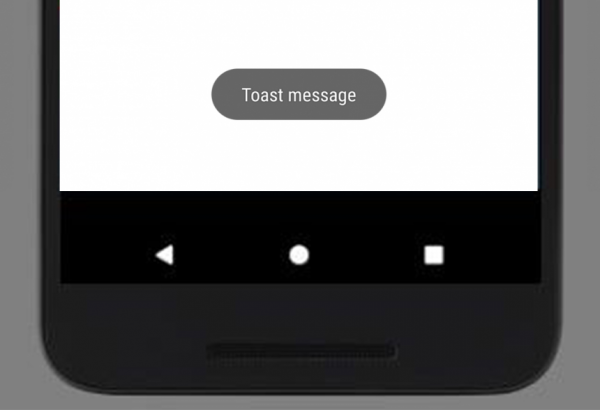
Android automatically supports a “Add to Home Screen” toast message feature. However, as a general rule, this message should show in iOS by default.
Note: Don’t neglect to design a toast message on iOS separately.
Deep Linking
Deep linking is the usage of URLs within the app that allows the user to navigate to other parts of the app or other locations.
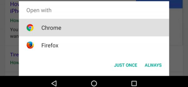
In PWA, if a user taps on a deep link, the appropriate page should open. If the user switches between two applications, the app should not start from the splash screen but return to the last known location where the user left it.
Note: Android supports this feature and the same has been updated in iOS version 12.2.
Updates
Quick toast message keeps the user updated and can be used to show time-critical information or action items. As a designer, it is very important to include the “App Update” message as a toast message, this is a standout feature and one that users should not ignore.
Credential Management
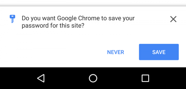
Android users can use the Smart Lock feature. However, iOS users find it difficult to bring and utilize credential data. On Android phones, Chrome always asks users if they wish to store the credential if the user is already logged in to the system.
Off-line support
Offline support is one of the key features of PWA. All native apps do not support (all) offline features all the time. This is a key reason to move from native to PWA. A progressive web app can load the last seen page or save user data even when users face connectivity issues.
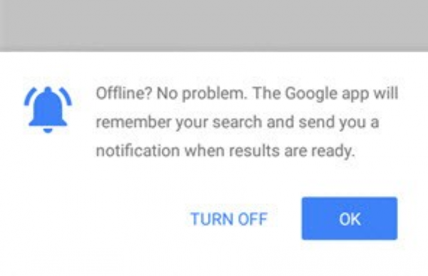
Note: Alert users about their offline status.
Vibration Alert
Chrome browser supports vibration alert in Android devices however Safari does not. Looking at Apple’s track record we hope to see this feature enabled soon.
Conclusion
While developers create apps, native or progressive, with certain intended navigation, users often find other ways to use these apps. To achieve a better user experience, designers and developers need to anticipate all user touchpoints and information they would want to see to aid better usage. These ten action items are must-dos for any designer working with PWAs.
If you think we’ve missed out any, tweet and let us know!
