Usability in reference to any human-made object means ease of using or learning to use that object. Similarly, in context to software applications, usability means ease and clarity with which software can be used by its end users.
An application is said to have a good usability if it is:
- Easy to use
- Easy to Learn
- Easy to Remember
- Recoverable from Errors
- Satisfactory to use
How ‘Usability’ originated in our team:
I am working with a team of 20 people designing a web application as a supply chain management solution for one of our leading clients. We are the offshore team and work with the onsite client team to deliver the best solutions possible. The onsite team gets requirements from the sales team, who in turn gets requirements from the end-user customers. The product is used by actual customers in the US and is continually evolving as each customer has a new requirement.
As a part of this project, I was testing a newly migrated UI for our web app. By migration I mean that only the look and feel of the app was being changed, not the functionality. It was purely UI testing, not functional. While testing, we maintained an Excel sheet of bugs found. This sheet was shared across the team. As the project progressed, the Excel sheet was filled with a number of bugs that the developer kept fixing. However, this task was taking more time than what we actually thought/estimated for, which usually happens with most of us. 🙂
The management team analyzed the reasons for the continual delay. While doing this activity, they observed the pattern of bugs, and found that most of the bugs were not actually “bugs” but differences in UI (a tester “acting” as an end user Vs. an actual end-user resulted different expectations). This triggered a thought:
“Why is it that the end-user didn’t expect the same thing that we developed; or, why didn’t we develop the same thing that the end-user might have expected”.
This was researched, and all searches led to things like: User Centered Design, Usability, User Experience, etc. The next step was to understand this and achieve it in our app?
My manager found a related course HFI-CUA, which is one of the best courses to study user centered design and understand it. HFI (Human Factors International) is a leader in usability practices and also imparts trainings for the same. So 2 of the team (my self included) took the course.
About HFI-CUA: It is a 10 day course which anyone and everyone with usability bent of mind (noticing way users do things their patterns, ease with which they do things, user preferences) can do. There’s no minimum experience/designation required to do this course. Details of the course can be found on their website. HFI-CUA.
After completing the course:
Few things that need to be addressed before going forward:
- The course in no way makes you an awesome UI designer.
- Usability in no way means you will learn latest UI technologies.
- Course in no way teaches you mobile designing.
- Design cannot be learned. So do not go to this course with this expectation of learning design.
All the above bullet points were the expectations that we all had from the course; however, nothing alike happened. However, other amazing things happened.
Amazing Thing 1: Putting into practice whatever we learned from the course.
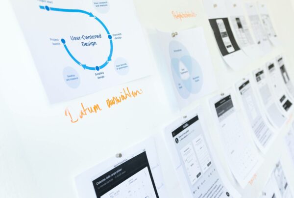
In order to put our new learning into practice, we modified the actual User Centered Design process that we learned in CUA course. The process we learned and that we used is illustrated as follows:

Though we skipped Step1 – User Centered Analysis (we didn’t have access to actual end users), it is still it is a very important part of User Centered Design. In our case, the client gave the requirements; and there was no/little scope for understanding the actual user need of the requirement.
To elaborate more on why this Step 1 is very important: Most of the time when we are designing something, we are actually redesigning it. That’s because it most likely exists in some way or another; and we are only designing a new way/approach to do it. Therefore, before you start designing it is very important to do Need Finding:
The way users are doing it currently.
- What are the challenges/hurdles they face doing it the way they are doing it.
- What is their motivation of doing that task?
- Is there a need to redesign?
As a part of Steps 2 & 3 (Design and Usability Testing), we created low fidelity wireframes (non-working prototypes that give an idea of UI and how it works). These mockups were shared with client before actual implementation and asked for their feedback. Any changes/feedback given by the client were made in the final implementation.
Benefits of implementing this process:
- No UI changes after the implementation.
- Both the teams onshore/offshore were on the same page in the sense that everybody could now have a visual view of what was being said and done.
- Client was very happy to see this extra effort of creating and sharing mockups, which enabled them visualize what they wanted before it was actually developed.
Amazing Thing II: Usability became a practice.
It took a lot of criticism and effort to get acceptance for a field that looked so simple and obvious, but trust me it was all WORTH IT.
Initially, usability, as the term implies, looked so simple and obvious to everyone that no separate resource was required to get it done, leaving aside a so called “Expert”. Nobody (except a few) thought making mock ups could in any way help the team; however we practiced it against all odds. There were times when people thought making wireframe was a complete waste of time and they could implement a feature in that time while mock was still being done.
Lessons Learned here:
Really keep a low fidelity wireframe a low fidelity wireframe—do NOT spend too much time making an early prototype so that team rejects the complete usability process altogether.
Keeping things simple is more easily said than done. People say what they developed is very simple because they have developed it; and they know how it works, and expect everyone to be able to easily understand it. For example, see at the below picture :
 Q: What do you see at first glance?
A: Some see a rabbit with ears and some see a bird with a beak.
Why do all people not see same thing? This is what happens with our designs.
By now usability was discussed so much that every member now looked at things with user’s point of view. Our client was so happy with the results of this process that they started adding usability-related enhancements to our sprints.
Few examples of my work done to improve usability of the supply chain management web app:
Example 1: As a part of the project, we were developing a calendar functionality where a user could configure events for particular date. Initially, we developed a design where, to add a new event we gave a button on the top right of the calendar view thinking it will be clearly visible on the top. (Figure 1)

The feature was successfully developed; and while in testing phase, I observed the working pattern of one of my peers testing the feature. I observed that each time she wanted to add an event, she would click on the date for which she intended to add a new event. After clicking, she realized that event has to be added using the Add button which was on the top right corner. This increased number of clicks. This was a redesign opportunity! I decided to make this small but significant.
The re-design was to match user’s mental model and to add an event by clicking on the date itself. Re-design not only saved user clicks, it also saved the user from selecting Date of the event (which user had to do in the earlier design). In contrast, in this design the date field was pre populated with the value of date on which user clicked to add the event. (Figure 2)

Example 2: Another requirement was to accommodate 5 pie charts in a single screen. Following are the before and after designs of the same screen:
Before: All the pie charts were simply put on screen as per the screen size.


The pie charts were categorically grouped and placed: one of the pie charts in the group was maximized while the others were miniatures. When a miniature pie chart is selected, it was swapped with the maximized one. A user could choose which pie chart to focus on.
To Summarize: My journey towards Usability at first appeared to be a theoretical experience with lot of heuristics to be learned. But the challenge of applying that theory and relating it to the real world made me dive deeper into the concept.
Food for thought: Usability is an independent work stream in itself and we are encouraged to apply it to existing/new projects. It can not only increase any application’s business but can also reduce training/maintenance costs of poorly designed applications.
Think of it this way, if a website’s information is hard to read or doesn’t let user’s complete key tasks, they leave. If an application is not intuitive and is hard to use, users avoid using it. Do you see a pattern here? There’s no such thing as a user reading a website manual or otherwise spending much time trying to figure out an interface. Unless there is no other way to complete a task; leaving is the first line of defense when users encounter a difficulty.
It is also important to identify when and how much time to spend on usability practices.
You can also follow my personal blog space: http://garimavohra25.blogspot.in/
