There are no shortcuts to quality. Some things like Software Architecture and User Experience (UX) need a systematic approach and sizeable efforts. Today, business is evolving faster than ever and mandates the solution to be relevant to the market on its arrival.
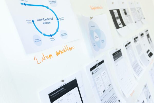
So there are scenarios, which demands rapid turnaround of UX for an existing product or a new product concept (in the form of POC/MVP), e.g. trying out a brilliant App idea in the sea of millions of existing out there. Our UX team dealt with this challenge and crystallized on the approach that a full-blown UX process can be treated as a template. It’s analogous to a buffet where you pick only what you see best-fit in a given business context which will deliver value during crunch time. Here is a quick take on this proven hack, which is imperfect (but evolving) but still serves the purpose effectively. Any comments/thoughts are most welcome to evolve it further…
Accept Operational Constraints
We consider UX process to have mainly 2 blocks:
- Foundation: Covers Strategy, Research, and Analysis Phases
- Iterative: Covers Design, Validation, and Development Phases
So if you are really dealing with a job, where your customer wants the first UX drop within 4-6 weeks from now, then you can’t afford to run/recommend a comprehensive Competitive Analysis, craft an immersive customer onboarding experience, conduct day-long User interviews, or run an Ethnographic study which will run for over 3-4 weeks. But, in such cases, we go with frugal engineering approach detailed below to meet the business acceptance criteria.
Get The Basics Right
In case of designing UX for a new product (POC/MVP), like a new Mobile App, we found that the Product Management review is extremely helpful in cut the pie for “Minimum” v/s “Viable”. Making a product Viable in the first drop itself is far-fetched in many cases. Mostly, the objective is to present the concept and get it validated or raise money or check workflow feasibility. So a Product Manager gives UX team a reality check and avoids the trap “little extra will make it market viable”. On the other hand, for UX refresh of an existing product, same Product Manager helps to identify “real pain point of the end user” to be addressed and minimizes the efforts of the UX team. Heuristic Evaluation comes extremely handy here. Especially such a scientific approach helps to win customer trust. Finally, seal your proposed UX Refresh with a quick “design validation” through guerilla testing.
Efficiency Is Key
When you have extremely limited time – real-time collaboration, parallel execution, and building on top of your efforts is the way to go. One powerful technique we use is evolving the design concept on the whiteboard and sharing it with the customer through Google Hangout (yet to get a “Jamboard”) or whiteboard photos for offline but rapid customer review. Real-time collaboration saves a lot for the time required during design review at a later stage. Then the UX team creates wireframes in “Sketch” and share through “InVision” for another review where in-context comments are captured. These wireframes are further evolved into Hi-Fi visual design, saving huge efforts. Ultimately various “Sketch” plugins come handy to exports design assets for developers too.
Be Creative
Many times, executives from the customer-side cannot “visualize the solution in action” on their toes. In such cases, our designers prefer to take visuals created in “Sketch” and use “Principle” to show animated prototypes for an instant demo and approval. It certainly works! Also, when we craft personas, we observe that the customer mostly pivots on a given personas’ interaction with the product on day #1 and not really think deep enough about day #10 or day #100 experience when that persona has evolved into a power user. So don’t be rigid in your design and leave some room to scale up/evolve at a later stage.
Avoid Noise
Setting right expectations upfront (and a bit over-delivering it) is the baseline of customer delight! The most common practice we follow is to limit the number of viewports/form factors supported by the first drop. Needless to say, everything is responsive by default. But still, cases like handling of iPhone X notch are explicitly mentioned as out of scope up front. Another example is rendering of PWA (Progressive Web Apps) on Safari (Beta Support) v/s Chrome (Full support). Finally, you can’t starve our developers until the design is ready. So we involve them at an early stage when layouts are defined so that they can choose/reuse suitable UI components. Another example is when IA (Information Architecture) is getting cast; backend developers can plan API endpoints by closely working with designers. Remember that developers are important, just like a shuttle to launch your design satellite.
But before you take this journey, get to know more real-life instances and learnings on our upcoming webinar on Building Great UX With A Remote Team.


