[rt_reading_time label=”Estimated reading time:” postfix=”minutes” postfix_singular=”minute”]
In part 2 of this series, I will cover add-ons, add them to a storybook, and add stories. Part 1 in this series introduces storybooks and is available here.
What are Add-ons?
Add-ons in a storybook are a node module that loads custom and essential add-ons to a storybook. In addition, it stores add-on loaders, communication channels, and other resources that storybook implementations use where required.
Types of add-ons:
Listed below are popular add-ons. Add-ons are an advanced feature and contain new workflows for storybooks.
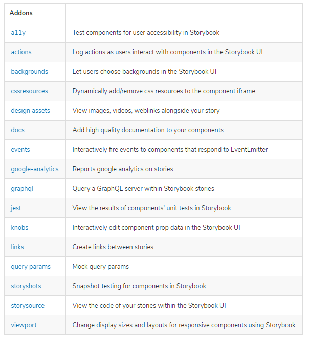
Deprecated Addons
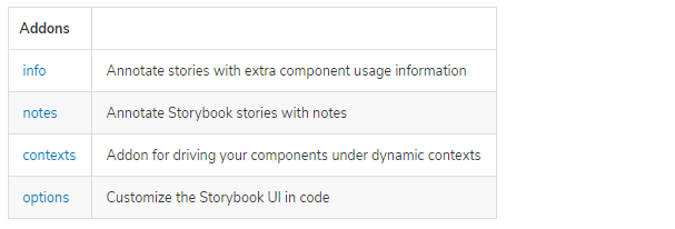
Essential add-ons in a storybook
Storybook gives, by default, a set of “essential” add-ons that we created in our initial storybook. These essential add-ons are pre-installed in the storybook, and there is no need to add them separately.
Essential add-ons include flowing add-ons:
Installation of add-ons in the storybook
Let’s take an example of installation of accessibility testing add-on in your storybook project using the following command:
npm install @storybook/addon-a11y
Note: You can install other add-ons like the same with the add-on name.
Next, update installed add-ons in the .storybook/main.js file to the following:
// .storybook/main.js

module.exports = {
 stories: [],
 addons: [
   // Other Storybook addons
    "@storybook/addon-essentials",
    "@storybook/addon-a11y", // the addon registered for a11y
    "storybook-addon-designs", // the addon registered for design addon
 ],
};
How Addons work and How to write stories:
Storybook provides heaps of reusable add-ons packaged as NPM modules. I’ll show you few add-ons with examples and how they work on isolated components.
Below are some powerful add-ons that greatly enhance the workflow,
Controls Addon:
When you write stories for any component, a function returns a component’s given state. This state is a set of arguments and uses the generic term arguments (args for short). In Angular’s, we use @Input.
We always write stories in button.stories.ts. The code below shows how to write stories for the button component.
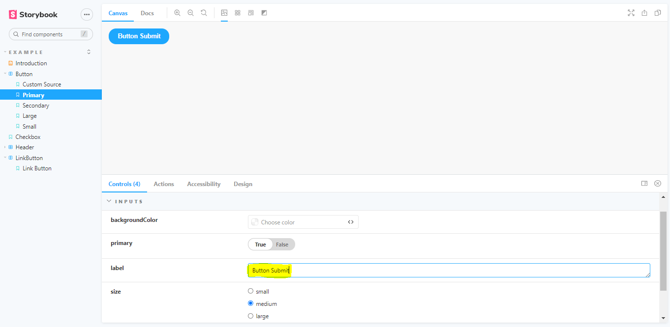
This code takes one button with the name primary and states that this is true. This action toggles the primary button to the secondary button in the control add-ons.
import { Story, Meta } from '@storybook/angular';
import Button from './button.component';
const Template: Story < Button > = (args: Button) => ({
    component: Button,
    props: args,
});
export const Primary = Template.bind({});
Primary.args = {
    primary: true,
    label: 'Button',
};
In the button.component.ts file, we must define the state for the primary button, and we can apply a primary color using a class on that button. Then, using control addons, we can change that state. The code gives a step-by-step flow of button stories.
// In HTML file

<button type="button" [ngClass]="btnColor">{{ label }}</button>`

In button.conponent.ts file


export default class ButtonComponent {
    @Input() primary = false;
    public get btnColor(): string[] {
        const mode = this.primary ? 'btn-primary' : 'btn-secondary';
        return ['btn', mode];
    }
}

// In CSS file
.btn {
    font-family: 'Nunito Sans', 'Helvetica Neue', Helvetica, Arial, sans-serif;
    font-weight: 700;
    border: 0;
    border-radius: 3em;
    cursor: pointer;
    display: inline-block;
    line-height: 1;
    font-size: 14px;
    padding: 11px 20px;
}
.btn-primary {
    color: white;
    background-color: #1ea7fd;
}
.btn-secondary {
    color: # 333;
    background-color: transparent;
    box-shadow: rgba(0, 0, 0, 0.15) 0px 0px 0px 1px inset;
}
Controls allow you to edit props through the Storybook interface dynamically. As a result, it is a significant development, testing, and debugging tool.
With Controls, you can change a button’s state or text from enabled to disabled simply by checking a box or changing a field.
Accessibility Add-on:
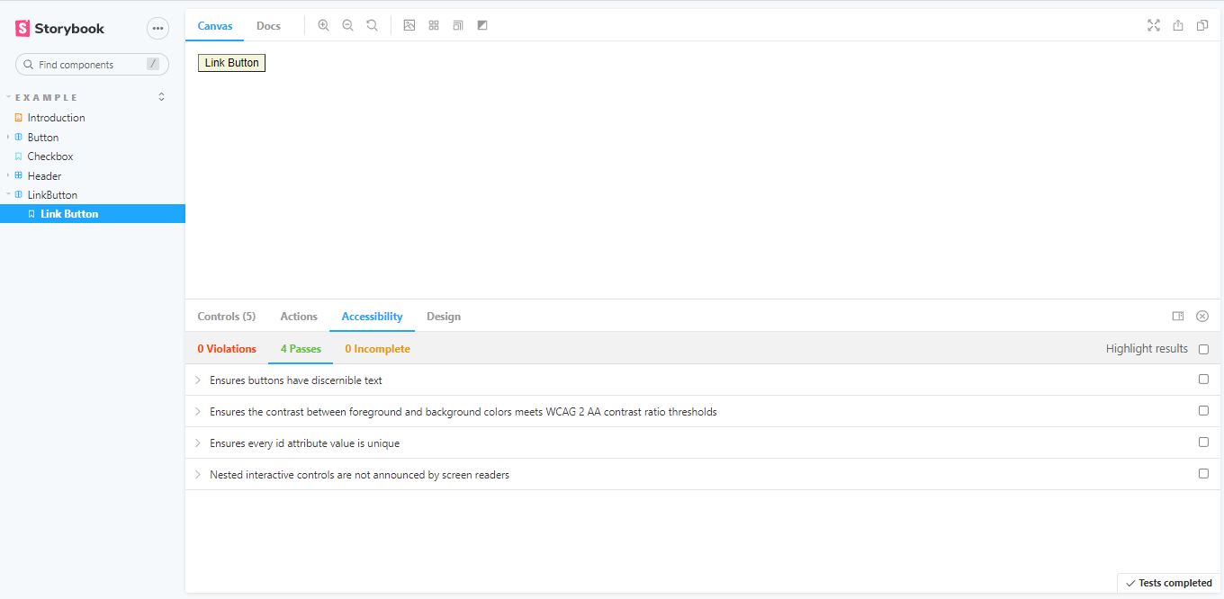
Accessibility add-ons check the accessibility rule on your components.
This check is beneficial for developers to understand which of these rules their components respect and which ones they need to fix. It also provides hints for how to fix it.
Docs Addon:
StoryBook Docs transform your Storybook stories into world-class component documentation.
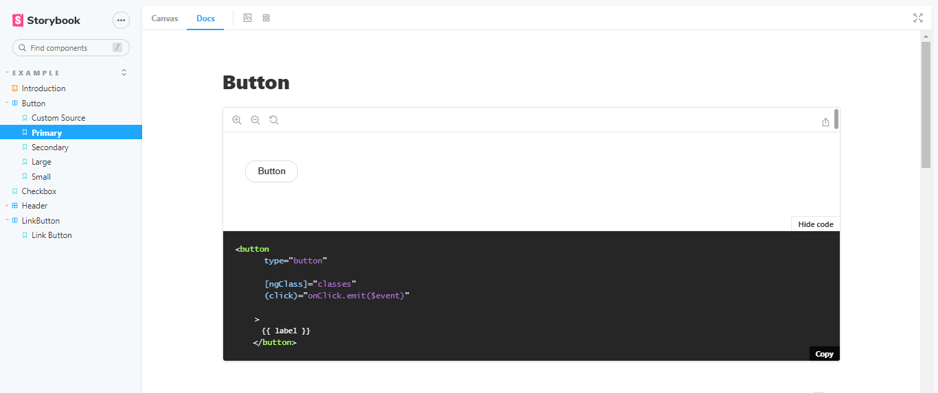
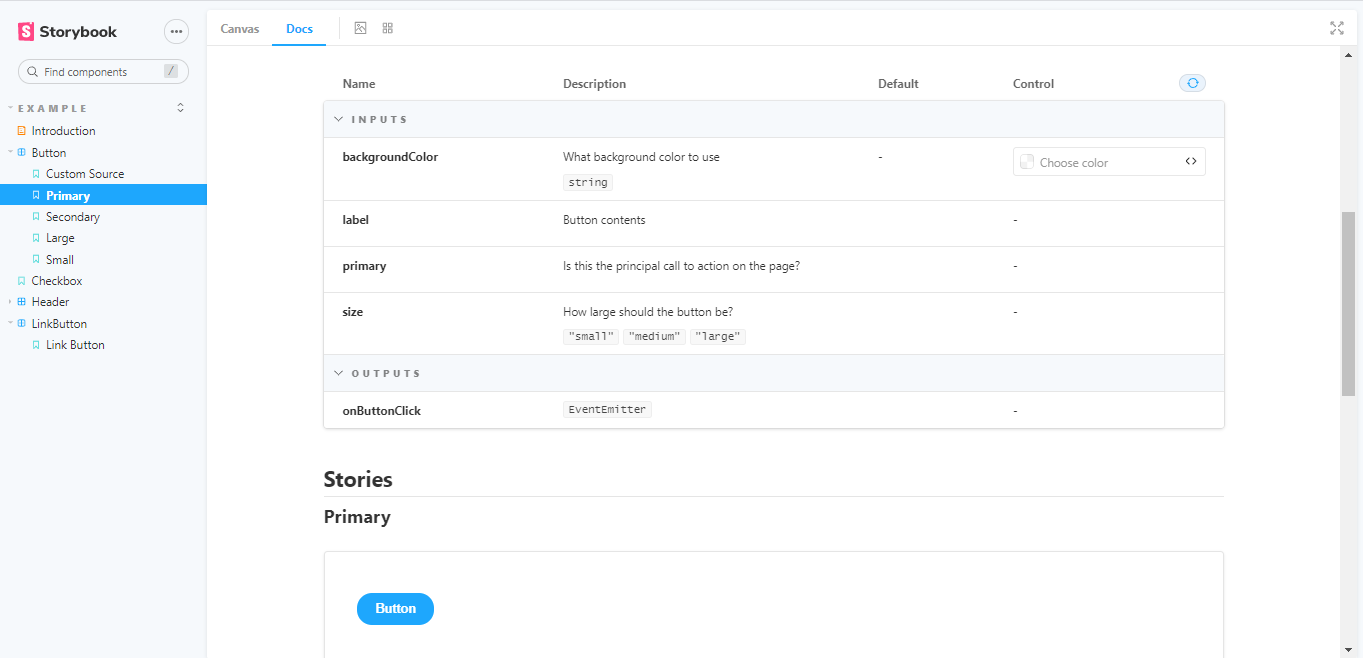
Your component stories, text descriptions, docgen comments, props tables, and code examples are clean, readable pages in the Docs-addon.
If you want more control in MDX, It allows you to write long-form markdown documentation and stories in one file.
You can also use it to write pure documentation pages and embed them inside your Storybook alongside your stories.
Viewport Addon:
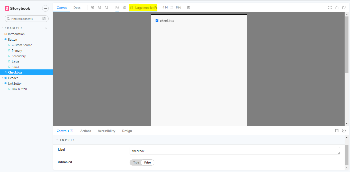
The Viewport add-on allows us to display our stories in different sizes and layouts. This add-on functions as your browser developer tool.
You can set popular layouts like a tablet, small mobile, large mobile, and desktop resolution. In addition, you can add custom viewports on your components to help visualize them in different environments.
Design Add-on:
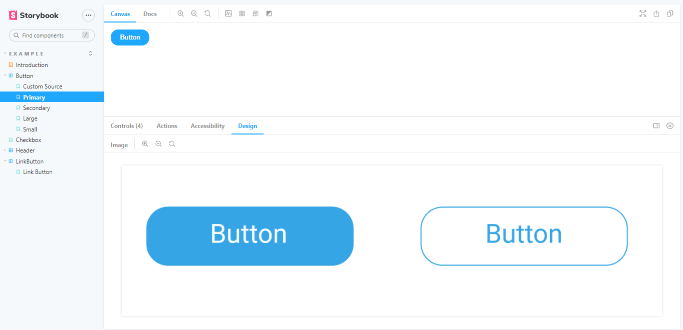
If you want to use UI designs in your Storybook page for any component, you can use the design using this add-on respectively.
They will help you deal with your component’s sizes, depths, line heights, and colors.
Actions Addon:
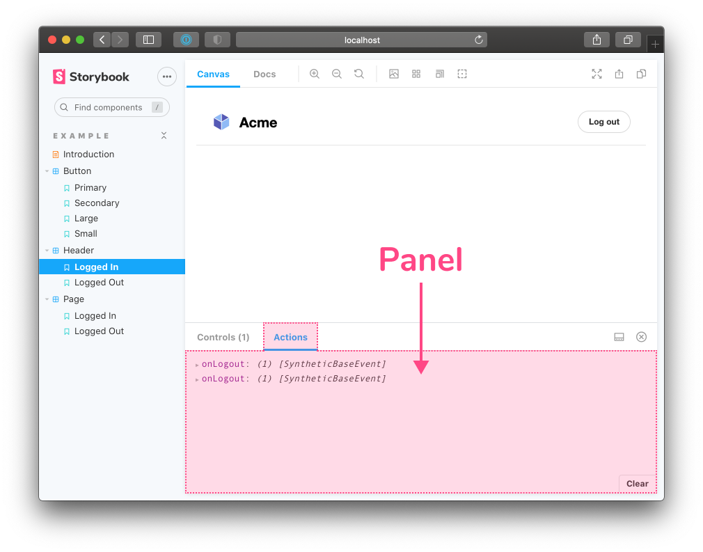
The Action add-on displays data received by event handlers.
It’s your event console.log(). With this add-on, you can check multiple actions on your component.
Conclusion
A storybook is an excellent approach to frontend development, and add-ons only increase its power. In addition, it gives developers superpowers to customize Storybook. Add-ons are a great addition to Storybook because it’s giving a better experience to developers.
About the author
[pods field=”blog_post_author”]
[pods field=”blog_post_author_bio”]


